
Client
Two Math Moms is an educational brand dedicated to making math enjoyable and accessible for children from kindergarten through 8th grade. They specialize in subscription boxes with hands-on activities to build kids' math confidence and love for learning.
Problem
Making math fun is a challenge, and early sales reflected this—low conversions and an unengaging site left the business struggling. They needed a full digital overhaul to convey the core idea: math can be fun and engaging!
Responsibilities
Website Audit and Heuristic Evaluation
Competitive Research
Information Architecture
Low and High Fidelity Wireframes
Developed on Shopify
Tools
FigJam
Figma


Website Audit: Unengaging Interface, Confusing Navigation, and Subpar UX
After discovery sessions to understand the client’s needs, I audited their website, cataloging every page, feature, and link. Obvious issues like a confusing interface, lack of storytelling, and generic stock photography stood out, while deeper challenges emerged through a comprehensive analysis of their goals and audience. This holistic approach provided valuable insights to guide the redesign process.
User Research
A 3-day workshop was conducted with the Two Math Mom stakeholders. My research encompassed -
• Conducted Stakeholder Interviews: Gathered insights into business needs, user pain points, and project requirements.
• Analyzed Market Trends: Reviewed competitor offerings and industry benchmarks to inform design decisions.
• Developed SEO Strategy: Aligned user experience design with SEO best practices for improved visibility and traffic.
• Mapped User Journeys: Created user journey maps to visualize the customer experience and identify potential friction points.
• Established a Cohesive Brand Identity: Created a unified brand identity to effectively communicate their mission and resonate with the target audience.
Qualitative Interviews
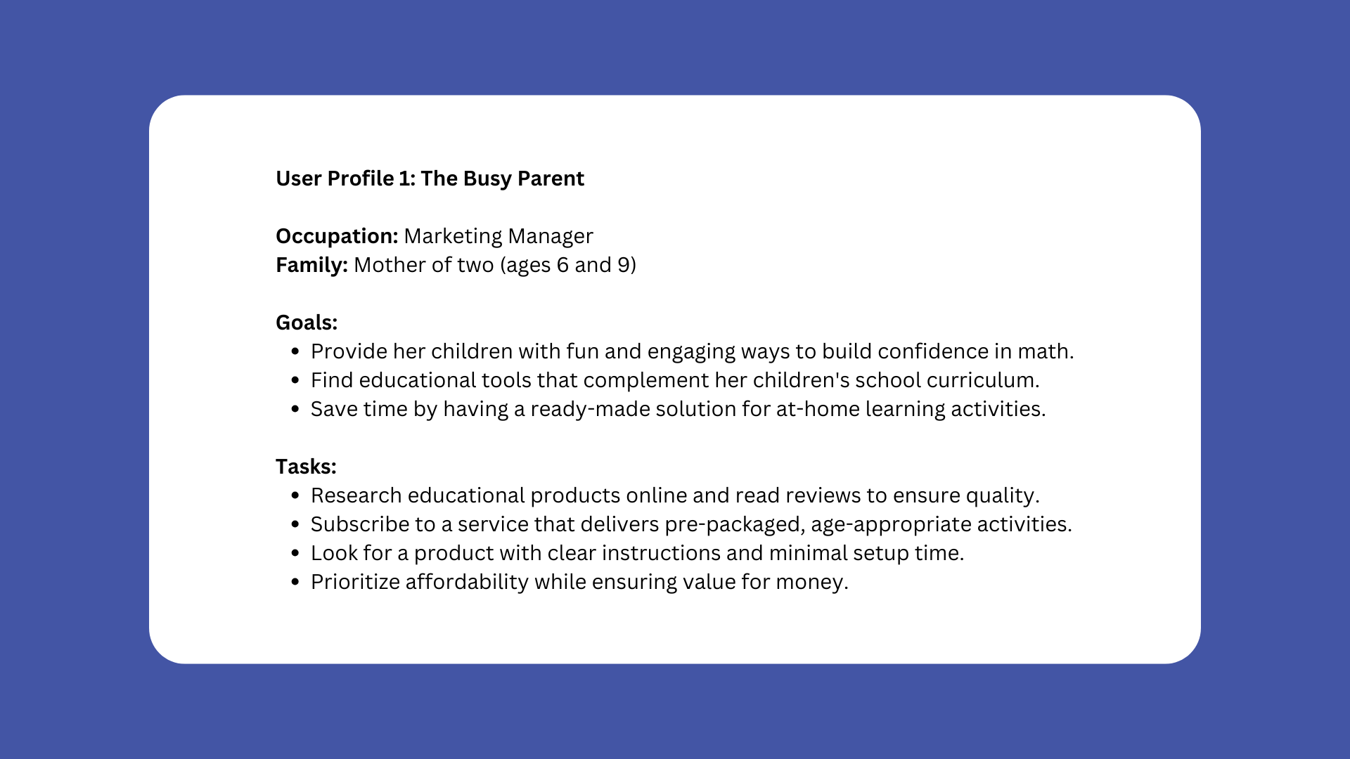
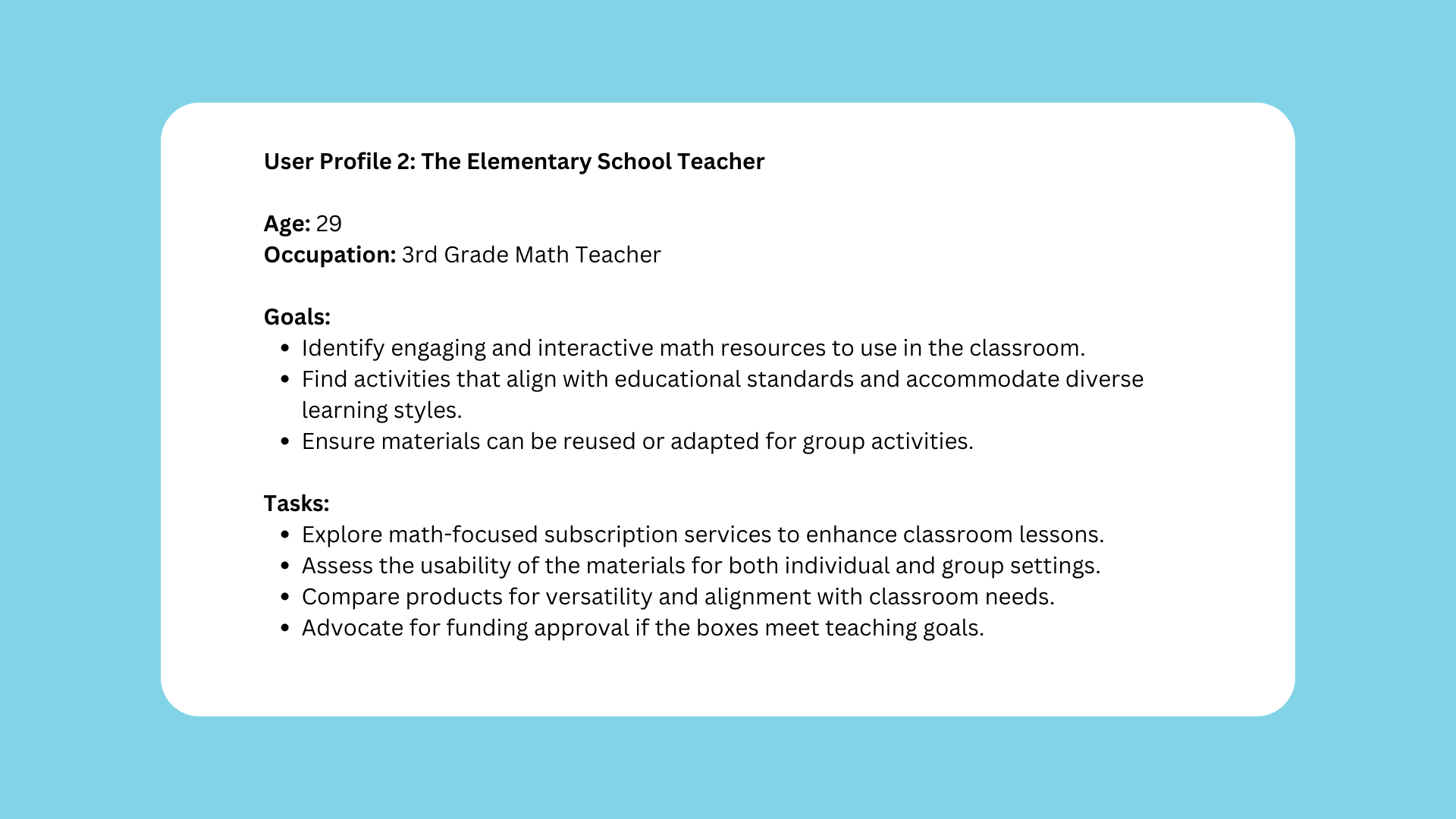
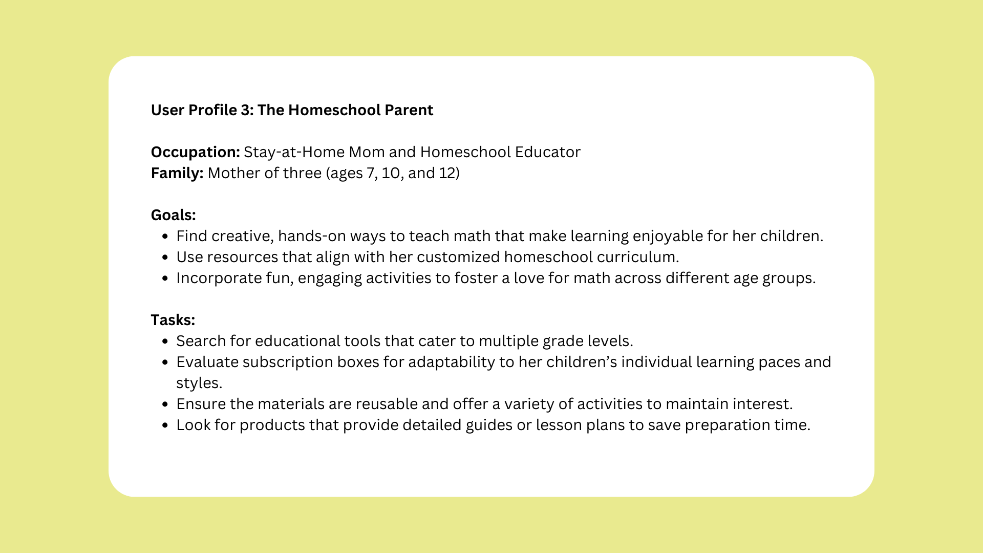
The qualitative interviews focused on understanding the needs, behaviors, and motivations of end users—parents, educators, and guardians of elementary-age children who seek engaging and educational products.

Guiding Insights


User Profiles
The research made it evident how diverse potential customers’ needs are and helped guide us in the UX decisions for the website and marketing. To cater to this, I categorized them into three user profiles based on their goals and tasks.
Conceptualization
I started creating the information architecture and low-fi concepts for primary use cases. After having all Stakeholders sign off on the mockups, we conducted usability tests with the low-fidelity mockups. Once we had confidence in the design, we began digitalizing designs.


Informational Architecture

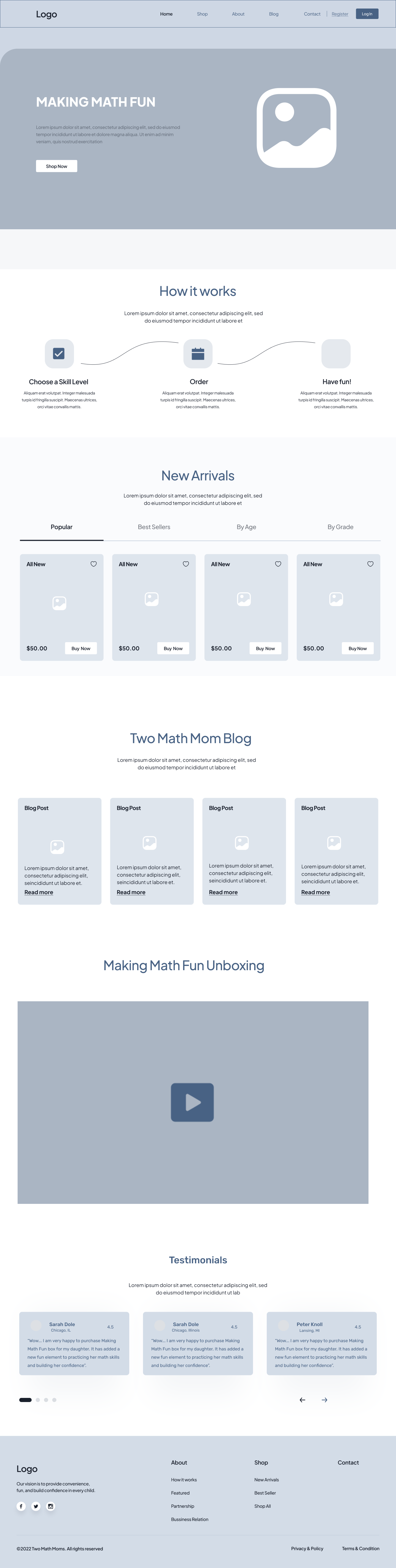
Hi-Fi Designs
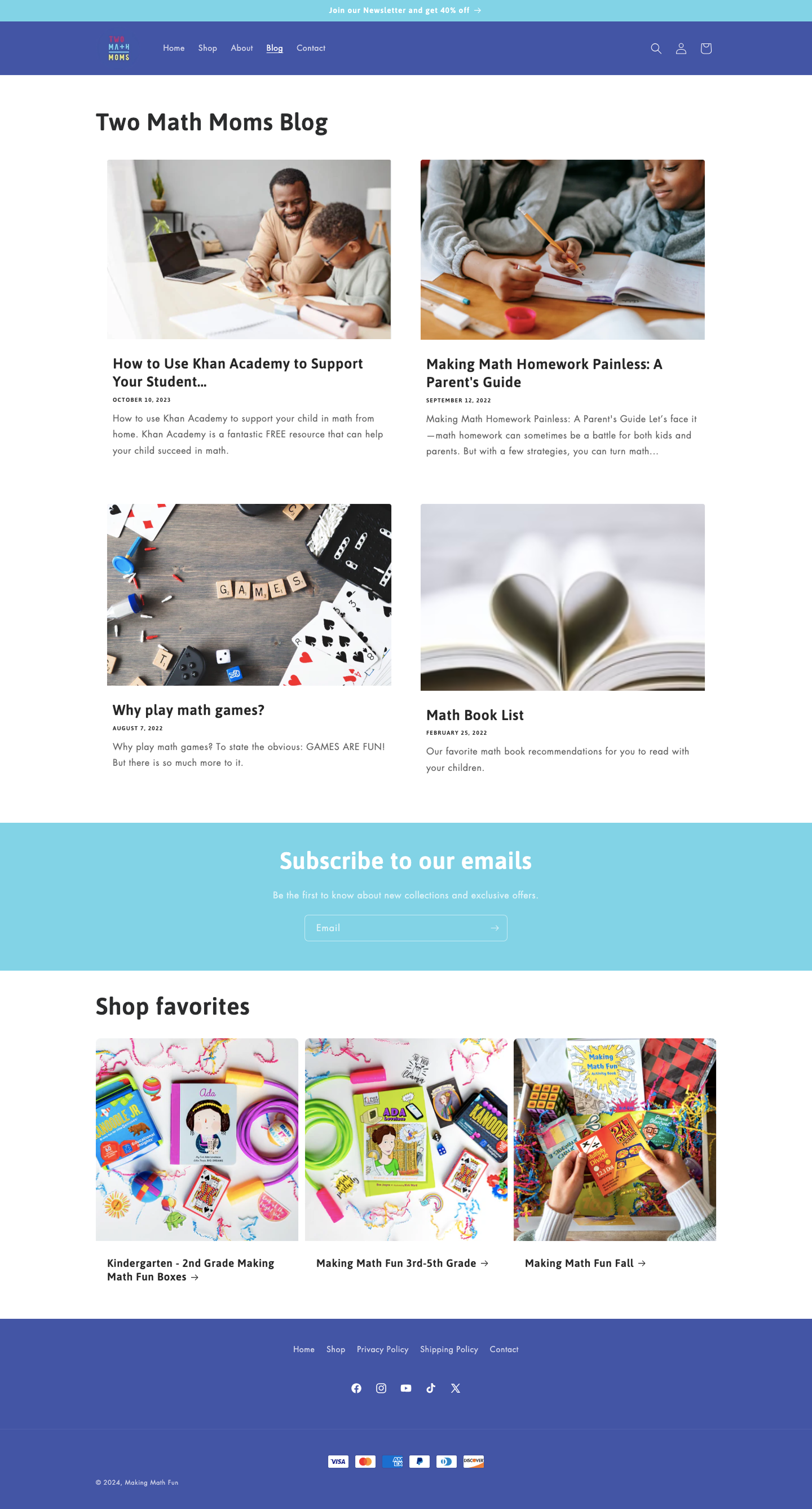
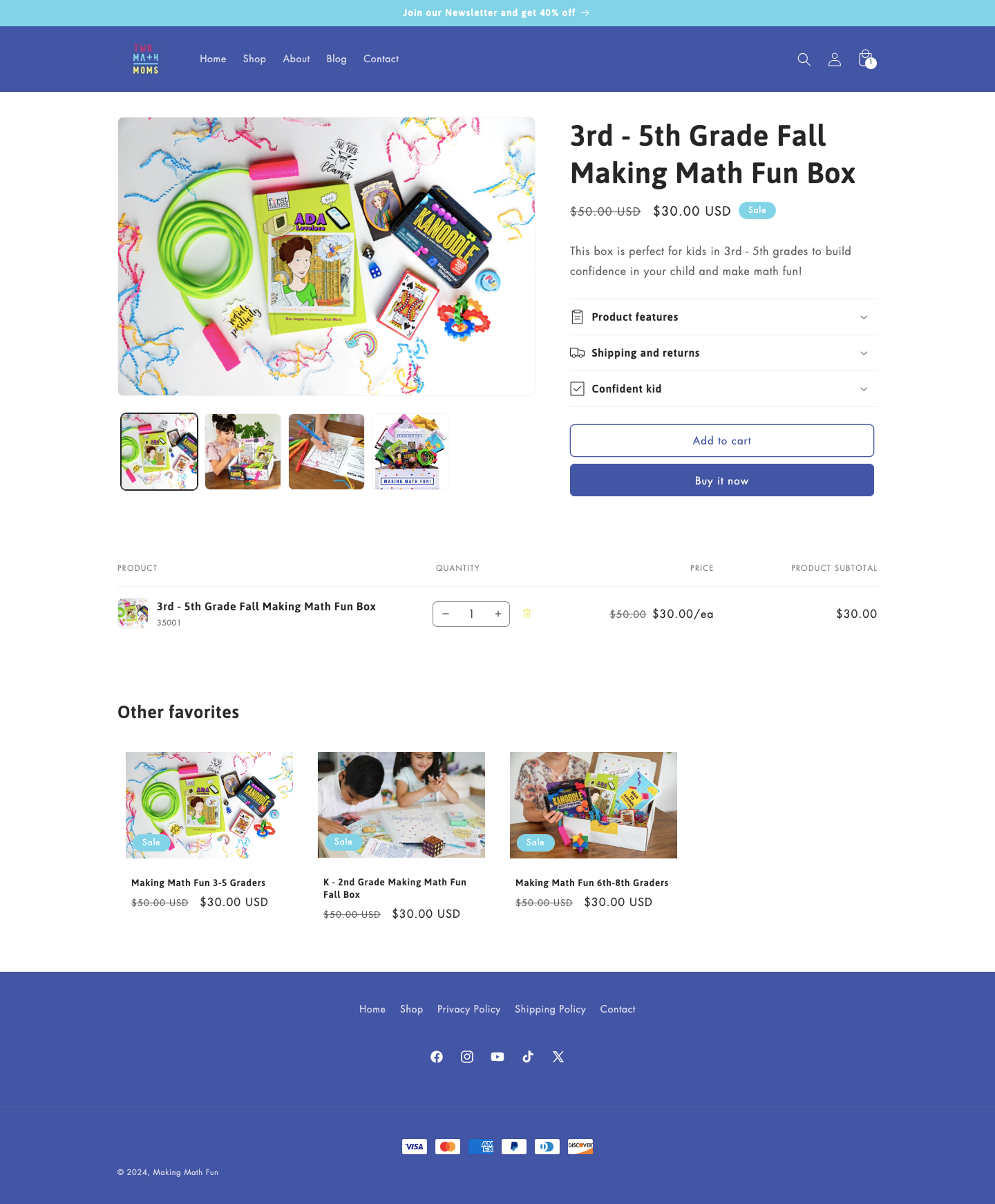
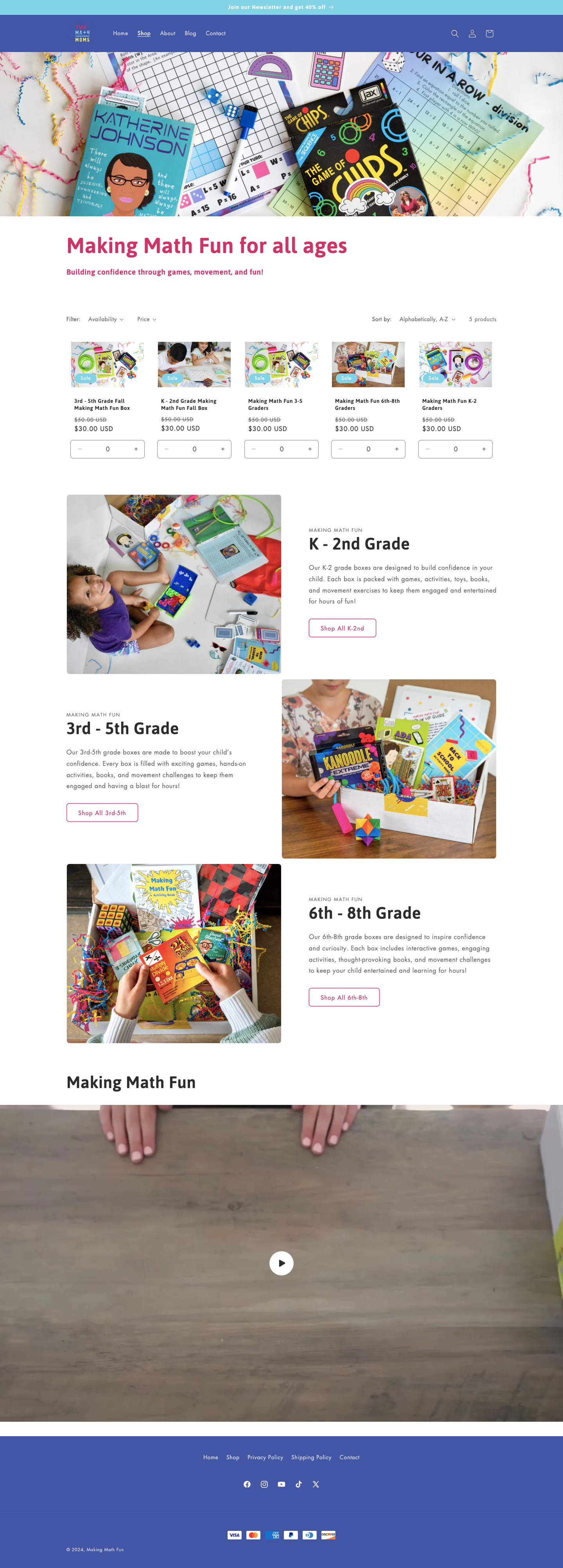

The Solution
Two Math Moms, an educational company focused on making math engaging for children, sought a website redesign for their Making Math Fun Subscription Box. The goal was to design a cohesive brand identity, improve user experience (UX), boost SEO rankings, and increase conversion rates to drive more subscriptions. Here is how I approached this:
Brand Overhaul
To address the lack of user engagement and failure to convey the core message that math is fun, we rebranded Making Math Fun to align with the brand’s mission. This included defining clear brand values and attributes, designing cohesive branding elements, and developing a consistent design system. These changes ensured the website not only communicated the excitement of learning math but also provided an engaging and unified experience for users.
Streamlined Checkout Process
I streamlined the checkout process to make purchasing subscription boxes clearer, more intuitive, and hassle-free for our customers. By simplifying the steps, optimizing form fields, and adding clear prompts, I reduced friction and ensured users could easily complete their purchase. The seamless payment integration and the updated process now provide a smoother, more enjoyable shopping experience.
Enhancing User Experience: Personalization, Clarity, and Ease of Navigation
The redesigned Two Math Moms website introduced key features to improve user convenience and engagement. A new account creation system allows users to track orders, manage subscriptions, and customize their preferences. A pop-up confirmation now displays added items in the cart, providing immediate clarity during shopping. Additionally, a search bar in the navigation ensures users can quickly find products, creating a seamless and intuitive browsing experience. These updates prioritize personalization and usability to better meet user needs.
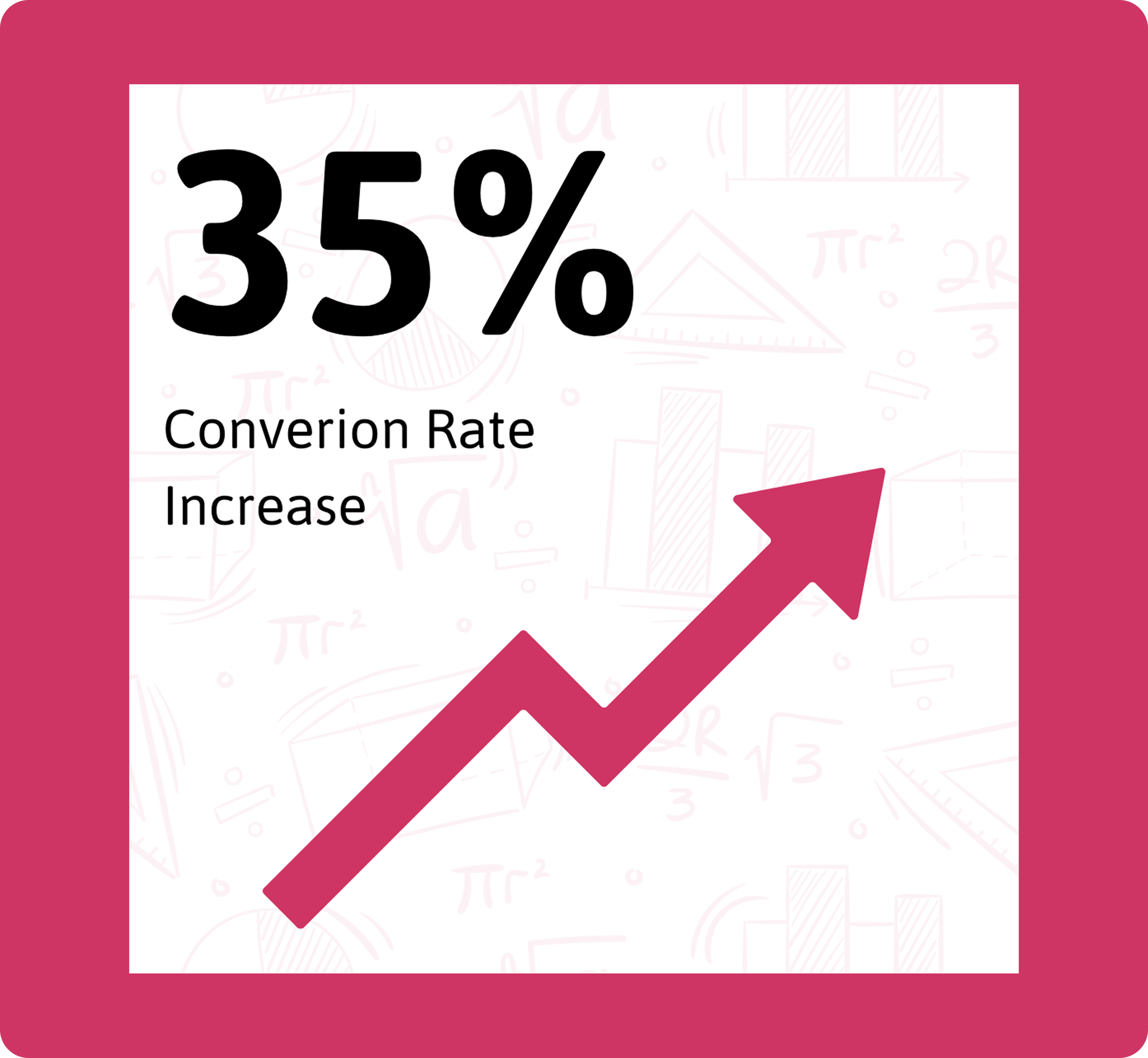
Data-Driven Success: How UX Redesign Transformed Two Math Moms’ Key Metrics


What I Learned from the Redesign Process
Redesigning the Making Math Fun website for Two Math Moms reinforced the importance of balancing educational engagement with usability. Through user research and iterative design, I gained key insights into how parents and educators interact with digital learning resources.
User-Centered Design is Key – Parents and teachers need a seamless, intuitive experience to quickly access math activities. Simplifying navigation and improving content hierarchy made it easier for users to find what they needed.
Visual Engagement Matters – Playful yet professional design elements helped strike the right balance between fun and credibility. A refined color palette and clear typography improved readability while keeping the site engaging for kids and adults.
Accessibility Enhances Usability – Ensuring the website was accessible for a wide range of users, including those with visual impairments, made the content more inclusive. Features like larger touch targets and alt text for images contributed to a better experience.
Iterative Testing Yields the Best Results – Conducting usability testing with parents and educators allowed me to refine the site based on real user feedback.
Content Strategy is Just as Important as Design – Simplifying the messaging and structuring content in a digestible way made learning resources more approachable. A strong content hierarchy ensured users could engage with the material efficiently.
This redesign not only improved the website’s functionality and appeal but also deepened my understanding of how thoughtful UX design can enhance the learning experience.
Next Steps
To continue improving Making Math Fun, the next steps include:
Gathering More User Feedback – Conduct additional usability testing with parents, teachers, and students to identify further refinements.
Enhancing Interactive Features – Explore adding more engaging elements like quizzes, animations, or gamified challenges to boost engagement.
Expanding Content – Develop new math activities and resources based on user needs and feedback.
Tracking Performance Metrics – Monitor user behavior and engagement data to measure the redesign’s impact and make data-driven improvements.
By iterating based on real user insights, Making Math Fun can continue evolving as an engaging and effective educational platform.