Redesigned a B2C / B2B website for a Settlement Firm
UX/UI Designer and Researcher | Team of 2 | May 2023 - Current
Role: UX Researcher and UX/UI Designer
Tools: Figma | Figjam | Optimal Workshop | Google Suite
Team: Two UX/UI Designers
Duration: 6 months
Value Added
-

Increased Engagement
Increased new client conversion rate by 5% and newsletter sign-up by 20%
-

Improved Usability
Decreased time users navigated to find information by 30% and clear CTAs
-

Enhanced Accessibility
Accessibility score increased from 40% to 96% and increased responsive design 100%

“[Lindsay] delivered results that exceeded our expectations. Lindsay's expertise and ability to explain the design process to non-designers made the entire project effortless for our firm .”
— Andy Prindable Founder of Prindable Settlements
Final Screens
Overview
As the lead UX Researcher and Designer, I led a team with another designer to revamp a B2C/B2B website for Prindable Settlements, a plaintiff-only Settlement Planning firm in Chicago. The goal was to create an engaging, user-friendly platform that facilitates connections between clients and attorneys, providing expert guidance and personalized solutions. The redesign focused on enhancing the user experience, ensuring visitors can easily access essential information, services, and effectively engage with the brand.
Problem
The existing website for Prindable Settlements faces several critical challenges.
User Experience (accessibility, navigation, and visual aesthetics).
Communication (mission, vision, services, and unique value proposition unclear and not effectively promoted).
Trust and Credibility (not adequately showcasing Andrew Prindable's expertise, industry experience, and successful track record).
Finally, the site lacks essential features and strategies for user engagement and conversion, hindering its ability to guide visitors toward desired actions and maximize its effectiveness.
Solution
The redesigned Prindable Settlements website aims to elevate the user experience, highlight the firm's expertise, and foster trust and engagement with both attorneys and clients. Through an updated visual design, streamlined navigation, and content that resonates with the target audience, the website will serve as a valuable online resource and a powerful tool for Prindable Settlements to reach, inform, and assist its clients effectively.

DISCOVERY
Team Kick-Off
In our kick-off call, the design team discussed project scope, deliverables, and client objectives, laying the foundation for collaboration. We assessed our strengths and weaknesses and shared a vision for a user-centered approach, prioritizing empathy and understanding end users' needs.
Client Call
In our first client call, we set expectations, established a timeline, and explained our design process. We addressed client questions and discussed concerns from our team meeting, including competitor identification and Google Analytics insights. This call was crucial for aligning objectives and ensuring a smooth redesign process for the settlement firm.
Competitive Analysis
During the discovery phase of the Prindable Settlements website redesign, we conducted a comprehensive competitive analysis. We examined key competitors' user interfaces, features, and overall user experiences to identify industry best practices and areas for differentiation. This analysis revealed opportunities for improvement and innovation, which we strategically integrated into our redesign efforts.
Heuristic Evaluation
As part of our research for the Prindable Settlements website redesign, we conducted a heuristic evaluation. This systematic assessment compared the current site's user interface against established usability heuristics and best practices. We reviewed navigation, content organization, information clarity, and overall user-friendliness. By identifying and documenting usability issues, we gained valuable insights that became the foundation for our redesign strategy, guiding us to create a more intuitive and user-centric experience for Prindable Settlements' audience.
Surveys and Interviews
To gain a better understanding of how we could more effectively address these problems, we conducted a series of user interviews and surveys.
Goals
Understanding User Needs: Interviews helped us uncover users' pain points, preferences, and behaviors. Surveys provided quantitative data on a larger scale, allowing us to understand broader trends and preferences.
Insights into User Behavior: By speaking directly to users, we gained insights into how they interact with the current website, what frustrates them, and what they find valuable. This informs the redesign process to address real user needs.
Validating Assumptions: Interviews and surveys helped validate assumptions about user behavior or preferences. This ensures that our design decisions were based on real user feedback rather than assumptions.
Identifying Opportunities for Improvement: Through feedback gathered in interviews and surveys, we were able to pinpoint areas of the website that need improvement or enhancement.
Enhancing User-Centric Design: Ultimately, these research methods contributed to a more user-centric design by ensuring that the redesigned website addresses the actual needs and preferences of its users.
Findings from interviews and surveys
Confusing Navigation
It was apparent that the navigation appeared somewhat confusing, causing users to encounter obstacles at specific points.
Communication
It became evident that the Prindable Settlements brand wasn't effectively communicated. Users didn't perceive the website's representation of the company's mission, services, and unique value proposition was unclear and not effectively promoted.
Trust and Credibility
It was highlighted that the website was not adequately showcasing Andrew Prindable's expertise, industry experience, and successful track record.
User engagement and conversion
The site lacks essential features and strategies for user engagement and conversion, hindering its ability to guide visitors toward desired actions and maximize its effectiveness.
Personas
We created personas using these insights to help designers and stakeholders understand their audience more deeply in order to create solutions based on the concept of User-Centered Design.
DEFINE
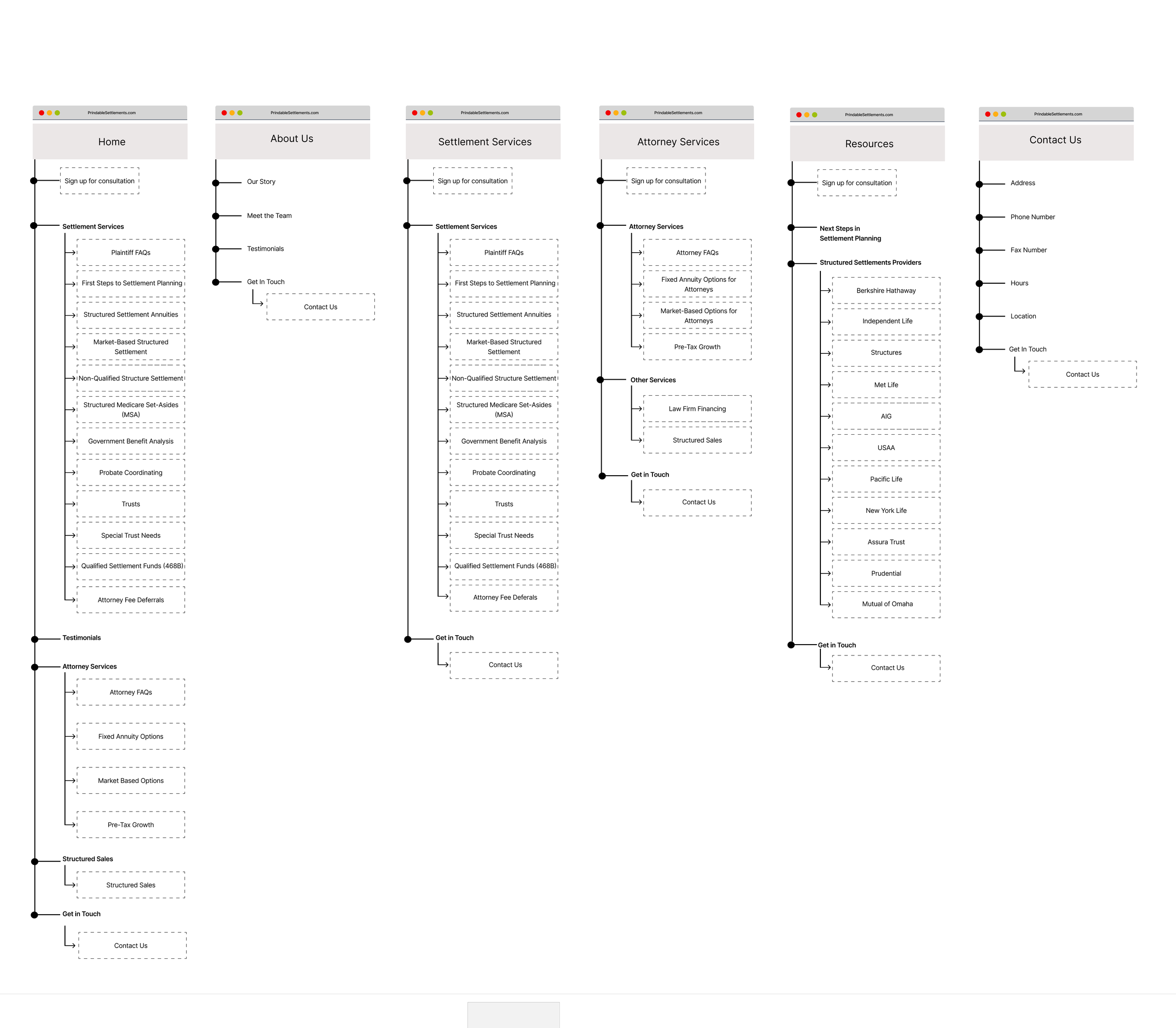
Information Architecture
In the defining phase of the website project, we prioritized restructuring the informational architecture (IA) for an improved overall experience. Analyzing the existing IA, doing a competitive analysis on the IA of competitors, conducting a card sort, and a tree test, we identified and addressed pain points, bottlenecks, and confusion, strategically enhancing clarity and efficiency. Our process:
With heavy informational content needed on the website the team had questions about the best way to organize the content, what main navigational options would be the most human-centric approach?
The Problem:
The team decided to use card sorting and tree testing to gain insights into users mental models and guide structure of the Informational Architecture of the content organization.
The Goal:
The team conducted an unmoderated open card sort and a tree test using Optimal Workshop. Participants sorted existing website content into categories, which we analyzed with dendrograms and similarity matrices for standardized categories. The tree test evaluated how easily users could find specific information or complete tasks.
The Tests:
The card sort results identified three main groups: Clients/Plaintiffs, Attorneys, and Website. The tree test showed high success and directness scores, confirming the effectiveness of our information architecture. By simplifying processes, streamlining navigation, and focusing on user-centric design, we created a seamless website that meets the diverse needs of Prindable Settlements' users.
The Results:
IDEATE
Design Inspiration
For the Prindable Settlements website redesign, we sought design inspiration from top industry websites, current trends, and content-heavy sites like news and consulting. We fostered creativity and innovation through brainstorming sessions, open dialogue, and diverse perspectives.
Lo-Fi Wireframes
For the Prindable Settlement website redesign, we started with low-fidelity wireframes to focus on the basic layout and architecture, emphasizing essential user interactions. We began with simple sketches and wireframes, allowing quick iteration and exploration of different design ideas.
These wireframes were crucial for evaluating site flow, element placement, and navigation. By keeping the designs minimalistic, we could easily incorporate user feedback and improve the user experience before moving to detailed prototypes. This approach ensured a user-oriented structure, laying a solid foundation for the design and development phases.
UI Iterations
During the UI design phase for the Prindable Settlements website project, we used an iterative approach to enhance the user interface, ensuring the visual design reflected the brand's identity and improved the user experience.
Starting with wireframes and client input, we explored various design options. Each iteration refined typography, color palettes, icon styles, and layouts, focusing on usability and visual appeal. Client feedback, usability testing, and A/B testing validated our design choices. By continuously integrating insights, we tailored the final UI to meet project objectives and resonate with the target audience.
Hi-Fi Wireframes
Our primary focus in transitioning from low-fidelity to high-fidelity wireframes for the Prindable Settlements website was refining the user interface to a pixel-perfect state, culminating in wireframes incorporating intricate details, precise typography, realistic imagery, ensuring visual elements aligned with the brand's identity, project objectives, and conveying responsive design across various devices and screen sizes.


Style Guide
We created a streamlined style guide for Prindable's website, covering typography, color palettes, icons, and UI components. This guide ensured design consistency and served as a reference for developers, resulting in a cohesive and user-friendly experience. Standardizing elements like icons and color schemes maintained brand identity and accessibility across the site.
Developer Handoff
We created a detailed developer handoff document aiming to seamlessly connect design with development. This comprehensive guide provided exact specifications for each UI element, interactive component, and responsive design feature, leaving no room for ambiguity and ensuring the accurate translation of our design vision into the final product.
Additionally, our developer handoff document extended beyond design specifications by encompassing valuable insights into user interactions. This inclusive approach aims to foster a shared understanding among all teams regarding the user experience, ultimately leading to a more cohesive and user-centric final product.
Reflection
Industry Restrictions and Regulations
Designing for the financial and legal industries involves navigating numerous restrictions and regulations. This challenge pushes me to develop creative solutions that comply with these parameters while delivering an effective user experience.
Flexibility and Adaptability
The scope of this project continued to change throughout the project. The client continued to see the value of our research and UX Design so our scope continued to expand and we needed to be flexible and adapt. (Yay! Another company seeing the value in UX Design!!)


